Waggle Network - Brand Design Guidelines
Waggle Network is a marketplace for retail investors to diversify their investments into tokens, they help project teams and early investors sell their locked tokens. Waggle had reached out to us to help build their brand visually.
The name ‘Waggle’ is to make a reference to the dance that bees do in pollination. They see themselves as hardworking bees who bring token sale deals (the honey) to retail investors (the hive/colony). We needed to communicate this idea to the world through what we did for them.
Waggle’s previous logo looked like that of an organic food brand, while they wanted a logo which would be more appropriate for a fintech brand. They also wanted one which would stand for the name. This might seem an arduous task at first but we took on the challenge.
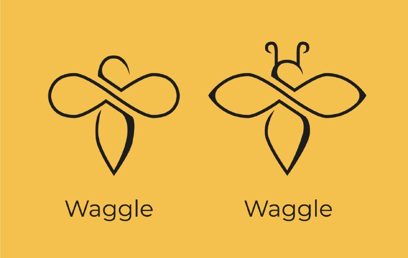
After a few rounds of discussion and understanding more about the brand we sent them certain ideas :
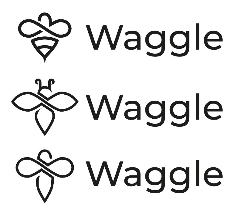
After a few more suggested changes by the brand, we finalised on this :
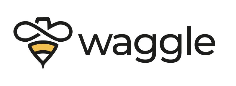
We kept the whole theme around what Waggle wanted – a retail friendly, technologically sound and credible brand.
Along with work on the logo we also provided them with brand guidelines on colour – wherein we specified what primary colours, secondary colours are to be used, and on typography as to the font that should be used.
Even though Waggle is set up in Singapore, that wasn’t a roadblock in working together smoothly and finishing the project in less than 3 weeks.
For enquiries – whodis@bakarmax.com